ArtSupport

ArtSupport is a digital platform that helps build sustainable careers in the arts through accessibility, resources and community. As the business successfully grew beyond its beginnings, the brand needed to evolve. The result is a refined identity that pairs nostalgic, utilitarian cues with a contemporary, playful energy.

Read More

ArtSupport

Beginning with strategy, we worked closely with founder Sophia to uncover ArtSupport’s essence, future goals and challenges. This revealed the need to evolve the brand identity to feel more confident and structured, able to sit comfortably alongside reputable institutions while retaining the rebellious, playful essence of the organisation.

‍

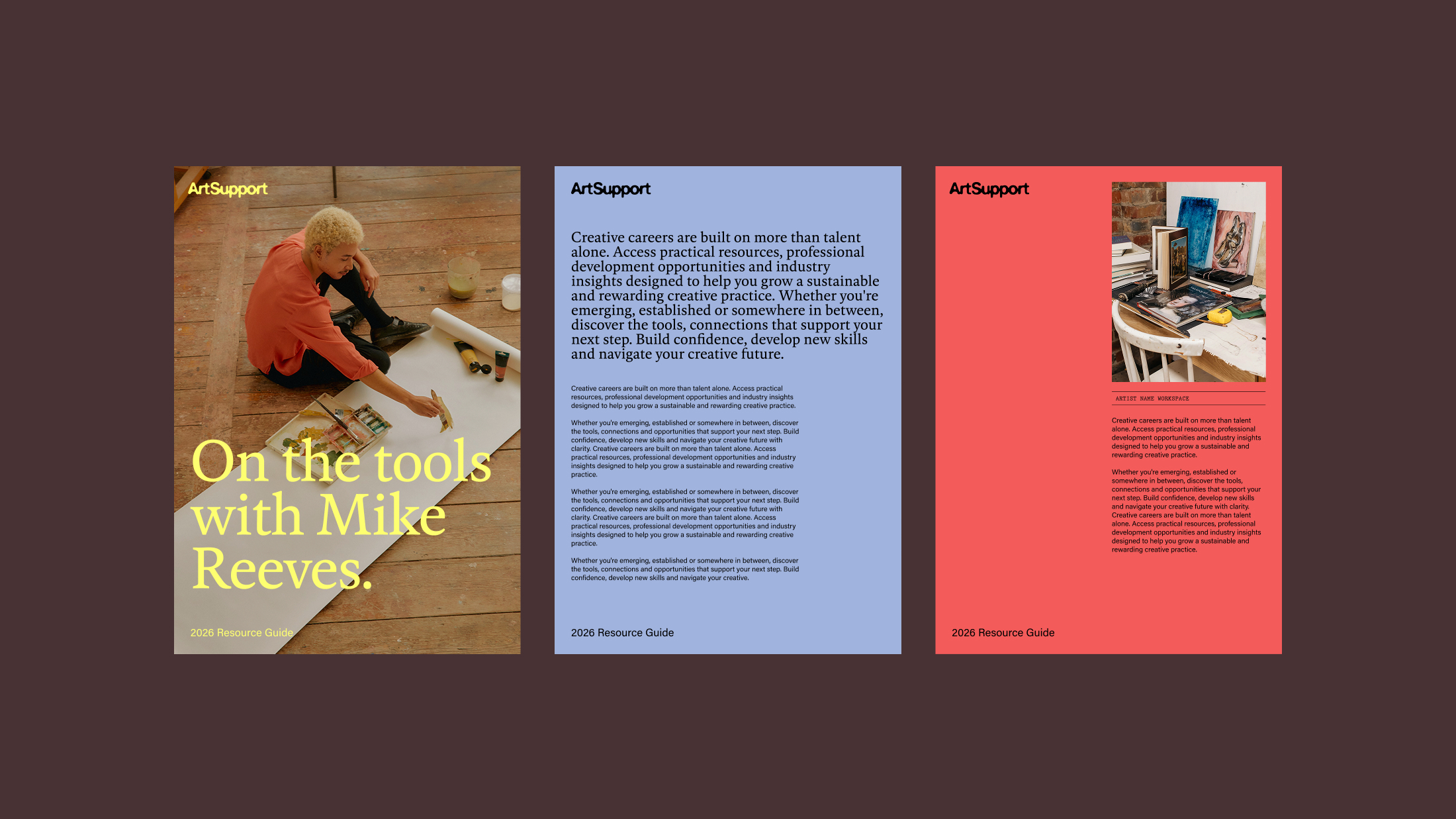
Drawing on utilitarian design cues, a touch of nostalgia is woven into a visual language and system inspired by noticeboards, bulletins and administrative systems. These compositions position ArtSupport as a single destination where resources come together in one accessible place.

‍

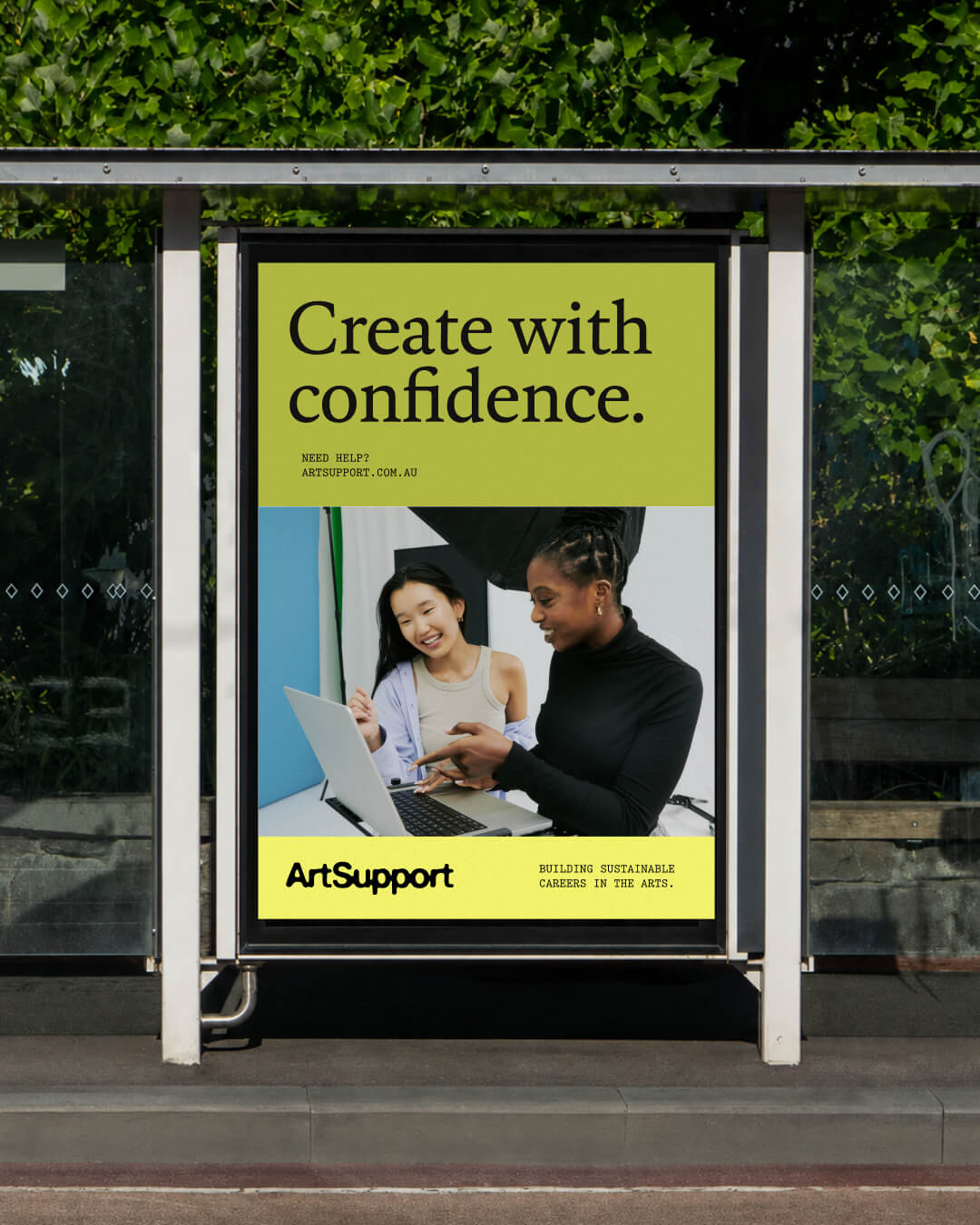
A disjointed colour palette and typography system had become a fundamental roadblock for the team, creating second-guessing with every new asset. To resolve this, we developed a colour system that balances web accessibility and high contrast with complementary tones. It was distilled into a two-part palette: the Foundation Palette, conveying stability and trust, and the Flourish Palette, expressing creativity and confidence.

‍

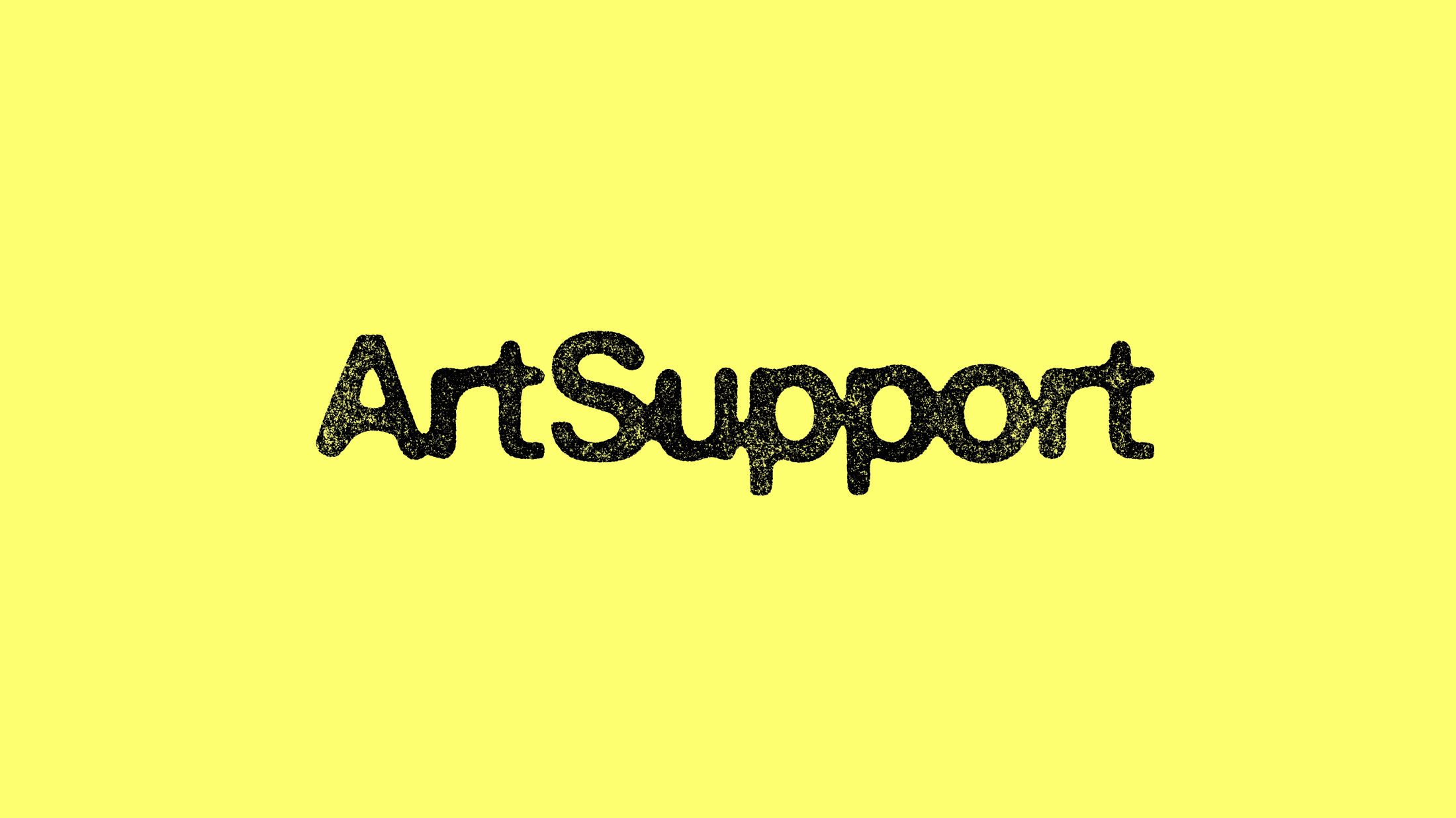
The custom wordmark features an ink bleed effect, allowing each letter to gently merge into the next. It symbolises the coming together of resources, opportunities, knowledge and community to form one connected entity. At the same time, each letter has been individually crafted with its own unique form, celebrating the independent hand of the artist and the individuality of every creative practice.

‍

Scope

Brand Identity Re-fresh

Brand Strategy

Identity
Creative Direction
Experiential
Packaging
Publication
Digital